


Case Study: Drive Safe & Save™ app
Case Study: Drive Safe & Save™ app
Case Study: Drive Safe & Save™ app
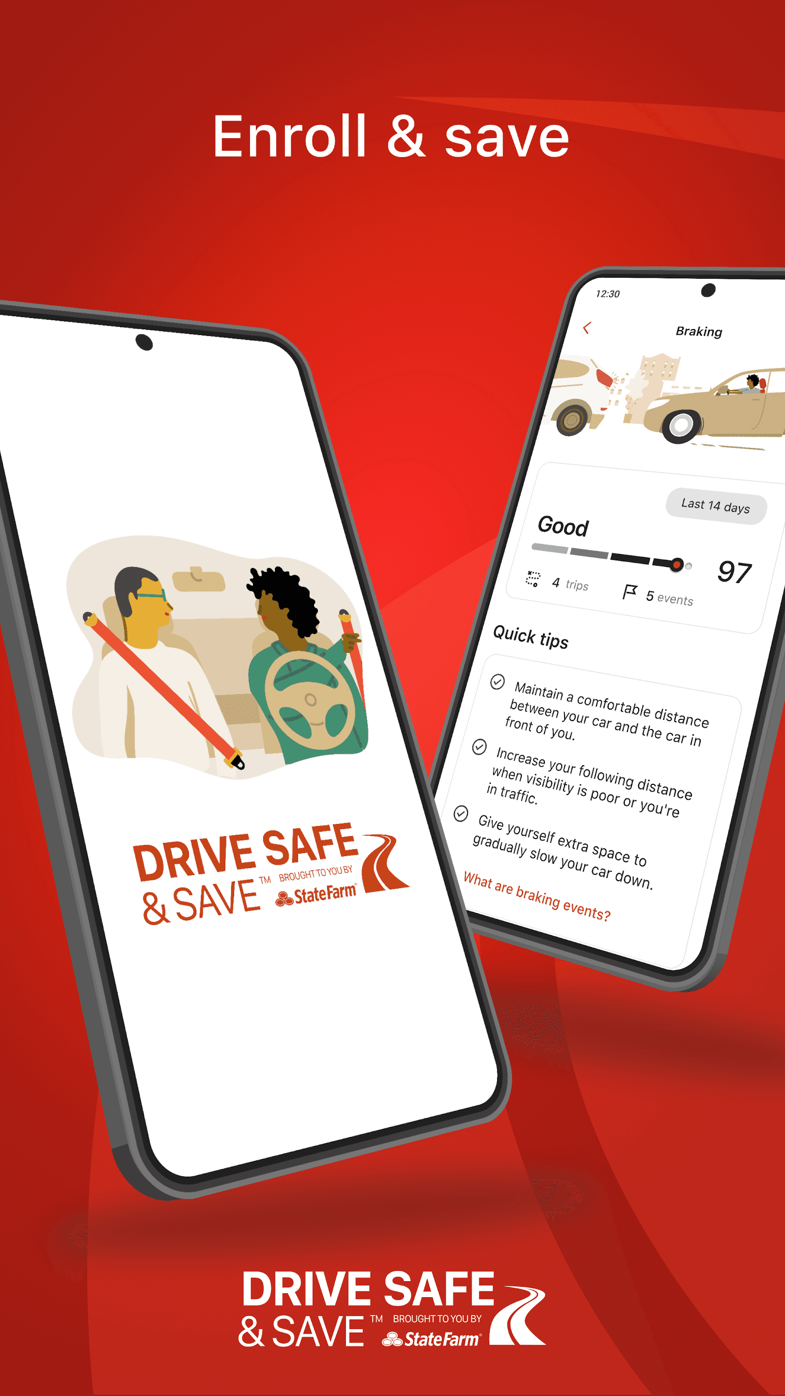
The “State Farm Drive Safe & Save” app is a usage-based insurance program that rewards safe driving with potential discounts on car insurance premiums. By using telematics technology through a smartphone app or a connected device like OnStar, the app monitors driving behaviors such as speed, braking, acceleration, and distance traveled. It provides real-time feedback and driving scores, encouraging safer driving habits. The safer you drive, the more you can save, with discounts based on your performance behind the wheel. This app is designed to help drivers take control of their insurance costs while promoting responsible driving practices.
The “State Farm Drive Safe & Save” app is a usage-based insurance program that rewards safe driving with potential discounts on car insurance premiums. By using telematics technology through a smartphone app or a connected device like OnStar, the app monitors driving behaviors such as speed, braking, acceleration, and distance traveled. It provides real-time feedback and driving scores, encouraging safer driving habits. The safer you drive, the more you can save, with discounts based on your performance behind the wheel. This app is designed to help drivers take control of their insurance costs while promoting responsible driving practices.
The “State Farm Drive Safe & Save” app is a usage-based insurance program that rewards safe driving with potential discounts on car insurance premiums. By using telematics technology through a smartphone app or a connected device like OnStar, the app monitors driving behaviors such as speed, braking, acceleration, and distance traveled. It provides real-time feedback and driving scores, encouraging safer driving habits. The safer you drive, the more you can save, with discounts based on your performance behind the wheel. This app is designed to help drivers take control of their insurance costs while promoting responsible driving practices.
The “State Farm Drive Safe & Save” app is a usage-based insurance program that rewards safe driving with potential discounts on car insurance premiums. By using telematics technology through a smartphone app or a connected device like OnStar, the app monitors driving behaviors such as speed, braking, acceleration, and distance traveled. It provides real-time feedback and driving scores, encouraging safer driving habits. The safer you drive, the more you can save, with discounts based on your performance behind the wheel. This app is designed to help drivers take control of their insurance costs while promoting responsible driving practices.

Objective
Objective
Objective
The score feature in the “State Farm Drive Safe & Save” app presents both opportunities and challenges from a UX design perspective. While a well-designed score interface has the potential to motivate users by providing clear, actionable feedback on their driving habits, the previous design did not effectively communicate how driving behaviors impacted the score and subsequent insurance savings.
The objective - replace the universal score with a more intuitive solution, such as color-coded indicators, progress bars, and easy-to-understand metrics. We increased the engagement of the users and maintained their motivation through positive reinforcement, rewards, and clear notifications. By removing the universal score and enhancing the individual scores, we addressed the gap. This was critical to improving the user experience and driving sustained engagement with the app.
The target audience are cost-conscious and motivated by the opportunity to reduce their insurance premiums through safe driving habits. This audience spans younger, tech-savvy drivers as well as more experienced drivers who value transparency and control over their costs.
These drivers seek real-time feedback, clear metrics, and positive reinforcement to improve their driving behavior. The app’s new design focuses on providing an intuitive interface with easy-to-understand score tracking and progress indicators, empowering users to take control of their savings while fostering a sense of accomplishment.

Research and Discovery
Research and Discovery
Research and Discovery
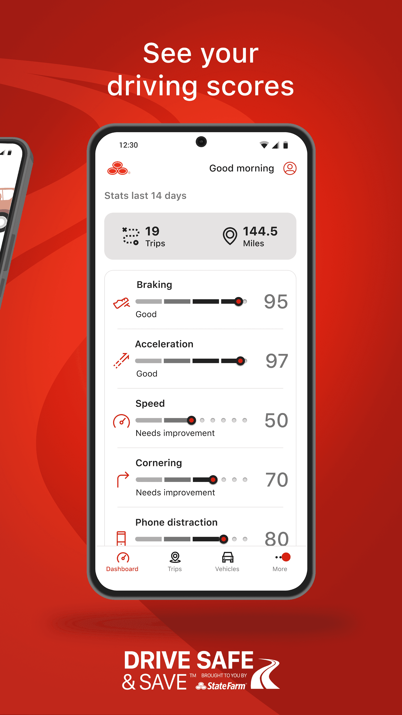
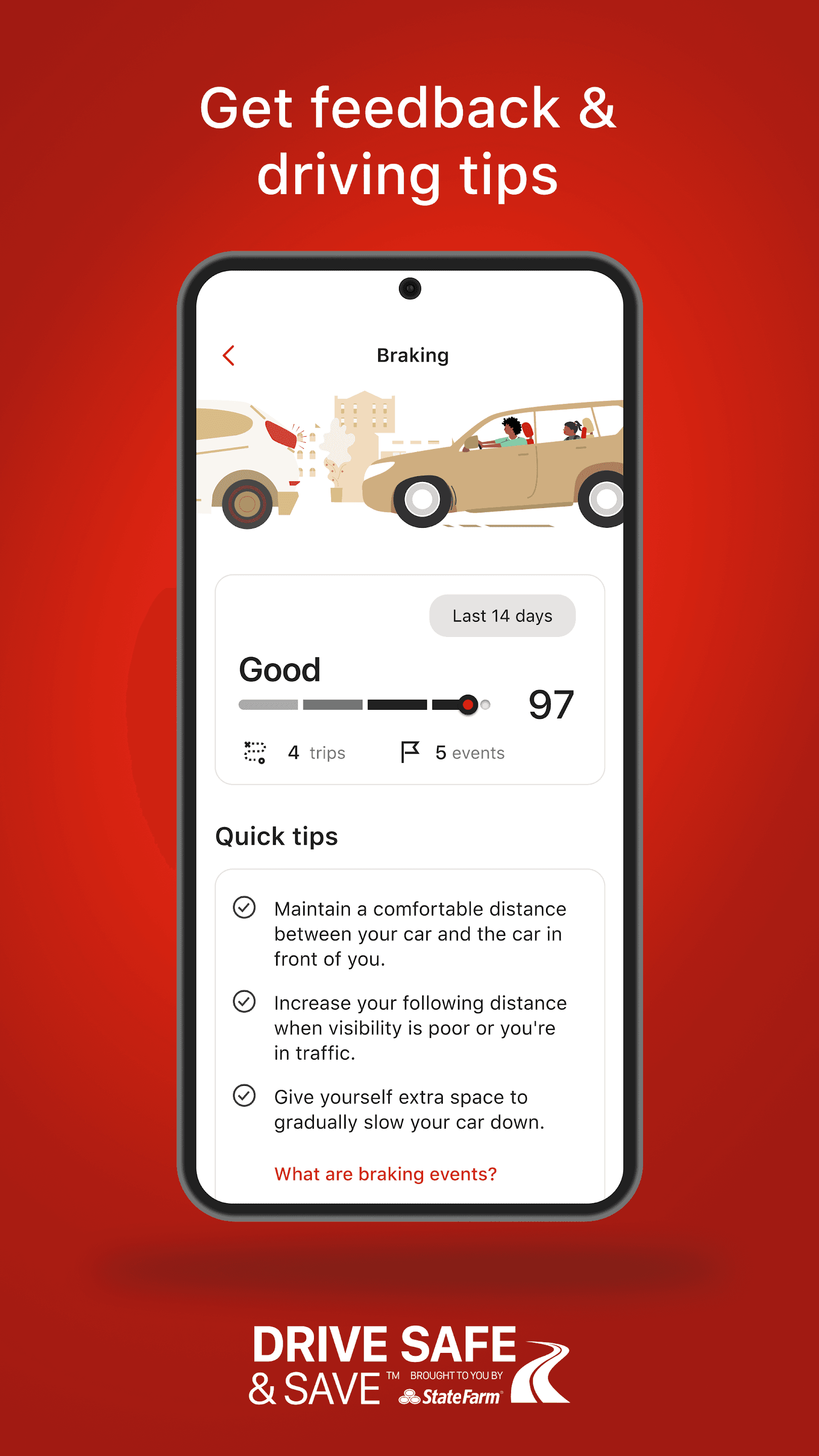
User research for updating the score design revealed key insights into user behavior and preferences. Interviews and usability testing showed that users often felt confused by how their driving habits translated into their score and potential savings. Many found the existing score interface overly complex under the surface, with unclear visuals and a lack of actionable feedback. Users expressed a desire for more intuitive and immediate understanding of how specific behaviors—such as hard braking or rapid acceleration—impacted their score.
Additionally, they sought clearer progress indicators and more personalized tips for improvement. These insights drove the decision to simplify the score design by incorporating clearer, color-coded feedback, more prominent progress bars, and direct suggestions for enhancing driving performance. Ultimately making the experience more transparent and engaging for users.
We developed user personas to better understand different user needs. For instance, “Tech-Savvy Tom,” a younger driver, appreciated the app’s technology but found the existing score interface confusing and wanted more instant, clear feedback. Meanwhile, “Cautious Cathy,” an older, more experienced driver, was motivated by savings but struggled with interpreting how her driving behavior directly affected her score. Both personas highlighted the need for more intuitive visuals, such as, simplified, color-coded indicators and personalized tips. These personas helped guide design decisions, ensuring the updated score feature catered to diverse user preferences by offering clearer feedback and more actionable insights.
This score totaled all the individual scores generated through all the driving behaviors. Users expressed they felt the score was judgy. Users stated it felt like a negative value placement on them. That being said, the course was set - remove universal score, design smaller driving score presentations and adjust all other screen elements (as needed) impacted by the change.
Building Blocks
Building Blocks
Building Blocks
The general brand design was well established, deep-dive iterations on the entire experience were not necessary - nor the objective. We strictly focused on revamping the scoring. The building blocks…
Colors
The general brand design was well established, so deep-dive iterations on the entire experience were not necessary - nor the objective. We strictly focused on revamping the scoring. The building blocks…
Colors
The general brand design was well established, deep-dive iterations on the entire experience were not necessary - nor the objective. We strictly focused on revamping the scoring. The building blocks…
Colors
The general brand design was well established, deep-dive iterations on the entire experience were not necessary - nor the objective. We strictly focused on revamping the scoring. The building blocks…
Colors
Fonts
Android: Mecherle Sans (left) / iOS: San Francisco Pro (right)
Fonts
Android: Mecherle Sans (left) / iOS: San Francisco Pro (right)
Fonts
Android: Mecherle Sans (left) / iOS: San Francisco Pro (right)
Fonts
Android: Mecherle Sans (left) / iOS: San Francisco Pro (right)


Branding
Branding
Branding


Iconography & Pictograms
Iconography & Pictograms
Iconography & Pictograms


Design Process
User research for updating the score design revealed key insights into user behavior and preferences. Interviews and usability testing showed that users often felt confused by how their driving habits translated into their score and potential savings. Many found the previous score interface overly simplified and confusing with unclear visuals and a lack of actionable feedback. Users expressed a desire for more intuitive and immediate understanding of how specific behaviors, such as hard braking or rapid acceleration, impacted their score. They asked for more of a breakdown.
Previous
Universal Score Design
Previous
Universal Score Design
Previous
Universal Score Design

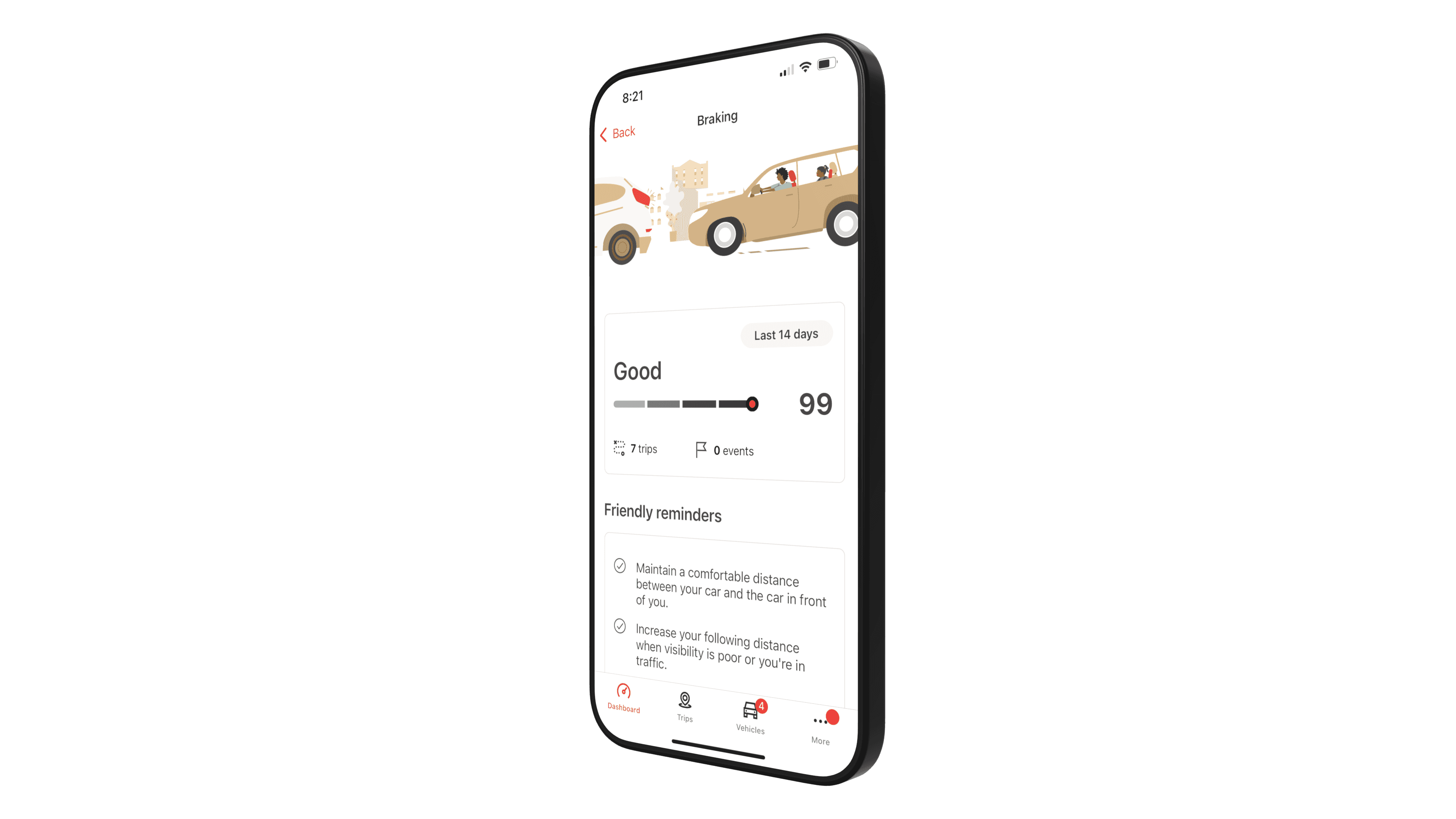
Current
Individual Score Design
Current
Individual Score Design
Current
Individual Score Design
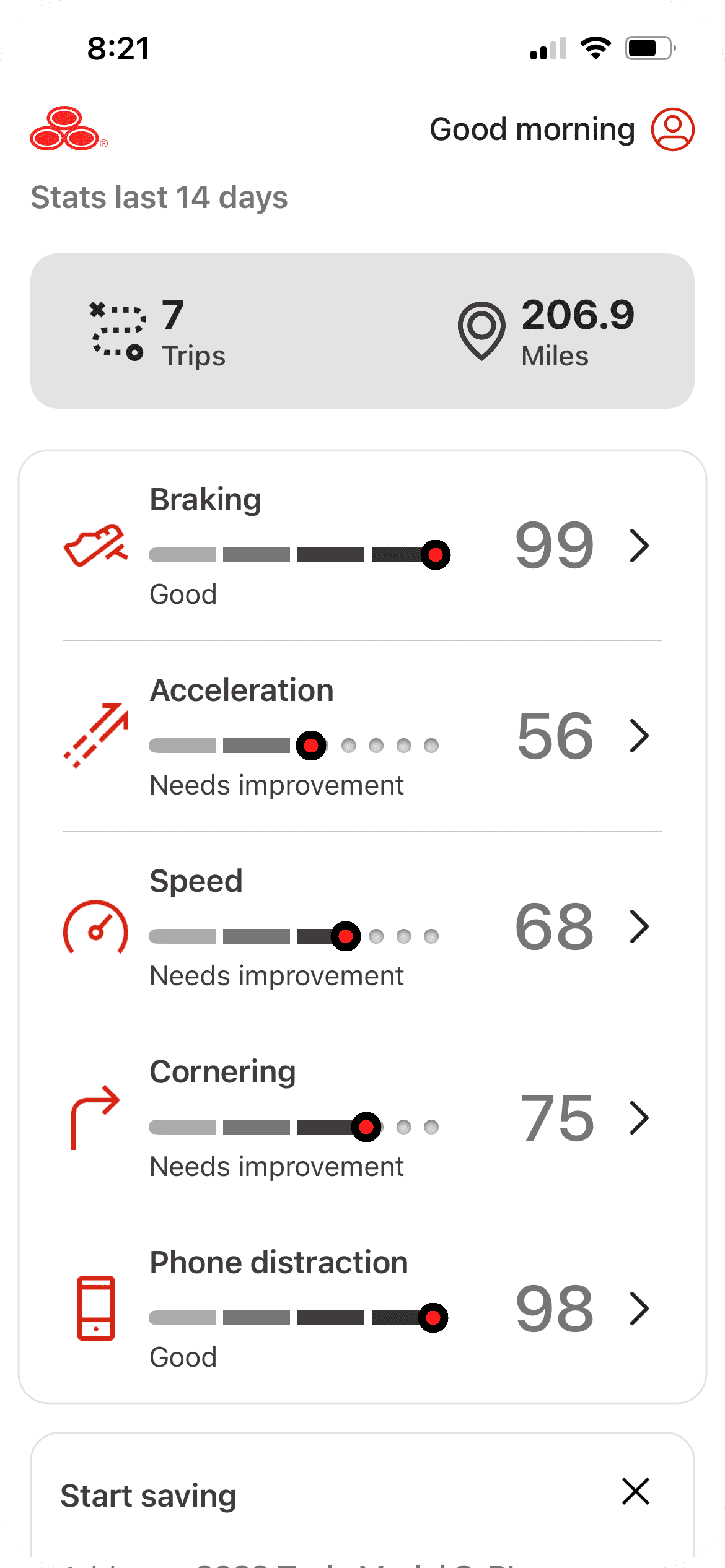
Many iterations on design characteristics (iconography, progress bar, number) and various layouts were excuted until we vetted out a solution. We felt this was clean and easy to read.
Many iterations on design characteristics (iconography, progress bar, number) and various layouts were excuted until we vetted out a solution. We felt this was clean and easy to read.
Many iterations on design characteristics (iconography, progress bar, number) and various layouts were excuted until we vetted out a solution. We felt this was clean and easy to read.
Design Concepts
Design Concepts
Design Concepts

Individual elements & States
Individual elements & States
Individual elements & States


