


Case Study: Drive Safe & Save™ app Gamification Exploration
Case Study: Drive Safe & Save™ app Gamification Exploration
Case Study: Drive Safe & Save™ app Gamification Exploration
Overview
While on the DSS (Drive Safe & Save) - UX Product Experience Design Team, addressing various tickets and issues, I was approached with an opportunity to lead a deep-dive exploration of game theory. The point was to gain insight on whether or not infusing the fundamentals of gamification into the DSS app was desirable, viable and/or feasible.
Problem Statement
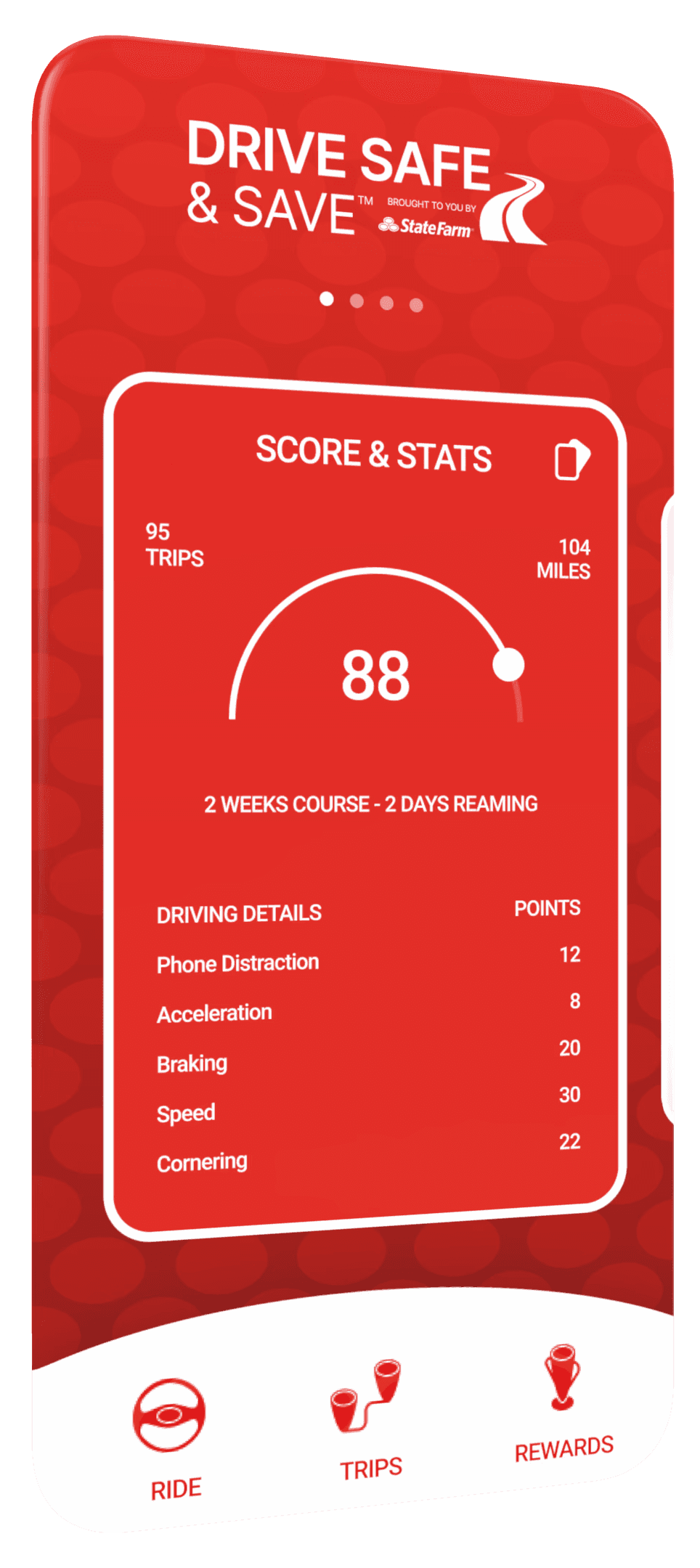
User testing surfaced the notion of the "Score" feature proving to be a bit off-putting. A fair amount of customers reported they felt as if they were being judged and unfairly at that. The Score was a true pain point. An example of the unfairness would be if the driver braked too quickly, the score would report that negatively and premiums would increase. The scoring feature did not take into account the cause of the sudden braking, such as if a neighbor's dog darting in front of the vehicle. In that case stopping abruptly would be considered the appropriate action.
So with this in mind, we set out to create a new experience to enhance user acceptance of the score, despite it's inability to account for the on-road circumstances. The new approach was to gamify the experience. Offering a fun, entertaining and engaging experience, counter-balancing the scoring aspect. …adding sugar to the medicine.
Problem Statement
User testing surfaced the notion of the "Score" feature proving to be a bit off-putting. A fair amount of customers reported they felt as if they were being judged and unfairly at that. The Score was a true pain point. An example of the unfairness would be if the driver braked too quickly, the score would report that negatively and premiums would increase. The scoring feature did not take into account the cause of the sudden braking, such as if a neighbor's dog darting in front of the vehicle. In that case stopping abruptly would be considered the appropriate action.
So with this in mind, we set out to create a new experience to enhance user acceptance of the score, despite it's inability to account for the on-road circumstances. The new approach was to gamify the experience. Offering a fun, entertaining and engaging experience, counter-balancing the scoring aspect. …adding sugar to the medicine.


Objectives & Goals
As with many design exploration endeavors, we discovered points of interest as we went alone. These points lead to specific goal setting and gave us targets to shoot for. "Zero envelope" was our mantra from the start. Avoiding as much confinement as possible. Safeguards were put into place to remove any chance of watering down the creative process. We wanted to see what was possible. We purposely ignored style-guides, other app in the wild as well as many other constraints normally applied. The only real metric we were concerned with was to make the scoring process dim in comparison to the other aspects or characteristics of the app.
Target Audience
For our efforts, the target audience for the “State Farm Drive Safe & Save” app really distilled down to two persona types. One (Older Adults/Parents), the older cost-saving person concerned with lowering premiums. And if they were a parent, the liked being able to review their child's driving behavior. The other (Younger Adults/Children), a younger driver not liking being scored and tracked. Plus the lack of a modern design … too serious and stogy. With this new product design, research with users was of a light affair but structured to be insightful. We never performed surveys nor usability testing. Being an experimental design process, we leaned on interviews - learning users want an app to be more engaging and less invasive.
"I want to see how the score is generated - how it effects my premiums."
James B.

"Seeing my kid's driving behavior is a win, but I'd like to see more incentive for good driving."
Maria R.

"I get it - saving money is cool, but so is having fun. I think the design is boring."
Sara S.

"I don't like the score. I feel like I'm being watched all the time. And then graded."
Chris P.
Research, Analysis and Strategy
In the decision to gamify the experience, our competitive analysis was viewed through the lens of building an Octalysis Framework. Created by Yu-Kai Chou. The framework promotes eight areas of interest. Those being… Epic Meaning, Accomplishment, Empowerment, Ownership, Social Influence, Security, Unpredictability and Avoidance. The core of gamification emphasizes human motivation by focusing on how people feel and behave throughout the process. This approach, called Human-Focused Design, differs from traditional function-focused design, which prioritizes efficiency or function over the user’s emotional and psychological experience. In gamification, the primary aim is to engage users by tapping into their desires, motivations, and emotions, encouraging participation and enhancing experiences. For reference, here are two examples of Octalysis Framework: X (Twitter) and Meta (Facebook).


Grouping the areas of interest helps assist in defining the personality of the app's experience. In using the framework, you could lean more in one direction or another. Simply address whether your app should be extrinsic or intrinsic. And/or if a white hat (positive motivation) or black hat (negative motivation) is preferred.
Grouping the areas of interest helps assist in defining the personality of the app's experience. In using the framework, you could lean more in one direction or another. Simply address whether your app should be extrinsic or intrinsic. And/or if a white hat (positive motivation) or black hat (negative motivation) is preferred.

After a fair amount of deliberation on the experience structure, it surfaced this conceptual design would be more extrinsic verses intrinsic as well as more white hat verses black.
After a fair amount of deliberation on the experience structure, it surfaced this conceptual design would be more extrinsic verses intrinsic as well as more white hat verses black.

User Journey & Pain Points
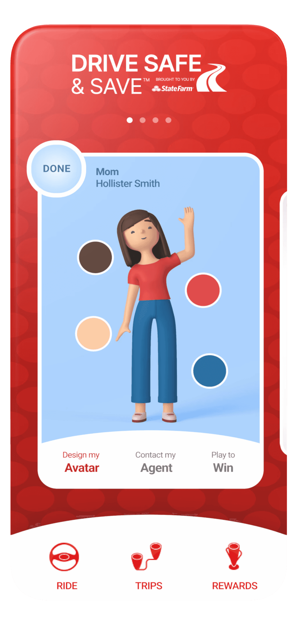
The user's journey was to be more of a visit, stay and play verses visit, read and leave. We wanted the app to be very sticky. The user's flow from screen to screen or one subject to another was not our primary concern, rather increasing their hang-time. Regarding pain points, the score was the only one. There were other smaller pains - language, tone and other topics. Our objective was to diminish the score's prominence without lose of relevance. Keeping it easily available, but not so dominate and intimidating. The thought was in doing away with the interpretation of instant judgement and replace it with other higher valued elements - such as an avatar. The user would login and instantly be drawn in with anticipation of being entertained, engaged as well as informed.
User Journey & Pain Points
The user's journey was to be more of a visit, stay and play verses visit, read and leave. We wanted the app to be very sticky. The user's flow from screen to screen or one subject to another was not our primary concern, rather increasing their hang-time. Regarding pain points, the score was the only one. There were other smaller pains - language, tone and other topics. Our objective was to diminish the score's prominence without lose of relevance. Keeping it easily available, but not so dominate and intimidating. The thought was in doing away with the interpretation of instant judgement and replace it with other higher valued elements - such as an avatar. The user would login and instantly be drawn in with anticipation of being entertained, engaged as well as informed.
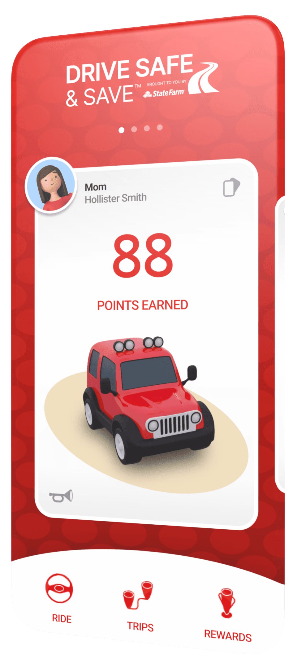
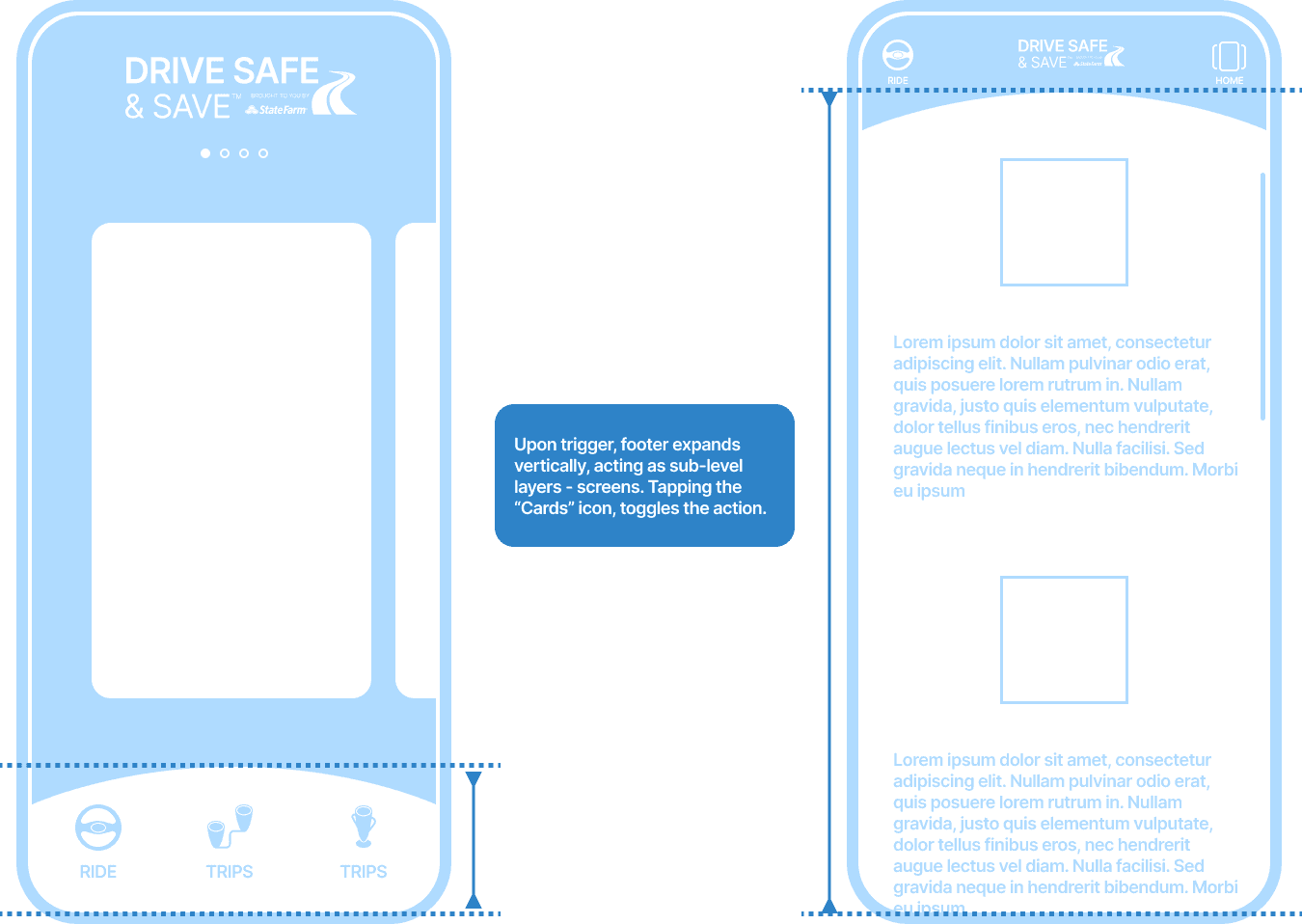
Design Process - Wires
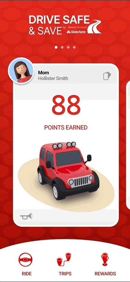
Iterating through many whiteboard sessions, we formulated a skeleton to build upon. Minimizing choice was paramount as to flatten out the cognitive load. The primary footer navigation was set to be no more than three options - Ride, Trips and Rewards.
Design Process - Wires
Iterating through many whiteboard sessions, we formulated a skeleton to build upon. Minimizing choice was paramount as to flatten out the cognitive load. The primary footer navigation was set to be no more than three options - Ride, Trips and Rewards.

With the concept of creating a two-layered stacked interface, the home screen (section or layer) would never be completely out of sight and always accessible via the "cards" icon. When initiated, the header space holds the active section, brand and cards icon. Tapping the cards icon, instantly slides the stacked layers back into the on-load position. The cards icon affectively is the home icon.
With the concept of creating a two-layered stacked interface, the home screen (section or layer) would never be completely out of sight and always accessible via the "cards" icon. When initiated, the header space holds the active section, brand and cards icon. Tapping the cards icon, instantly slides the stacked layers back into the on-load position. The cards icon affectively is the home icon.
Design Process - Influence
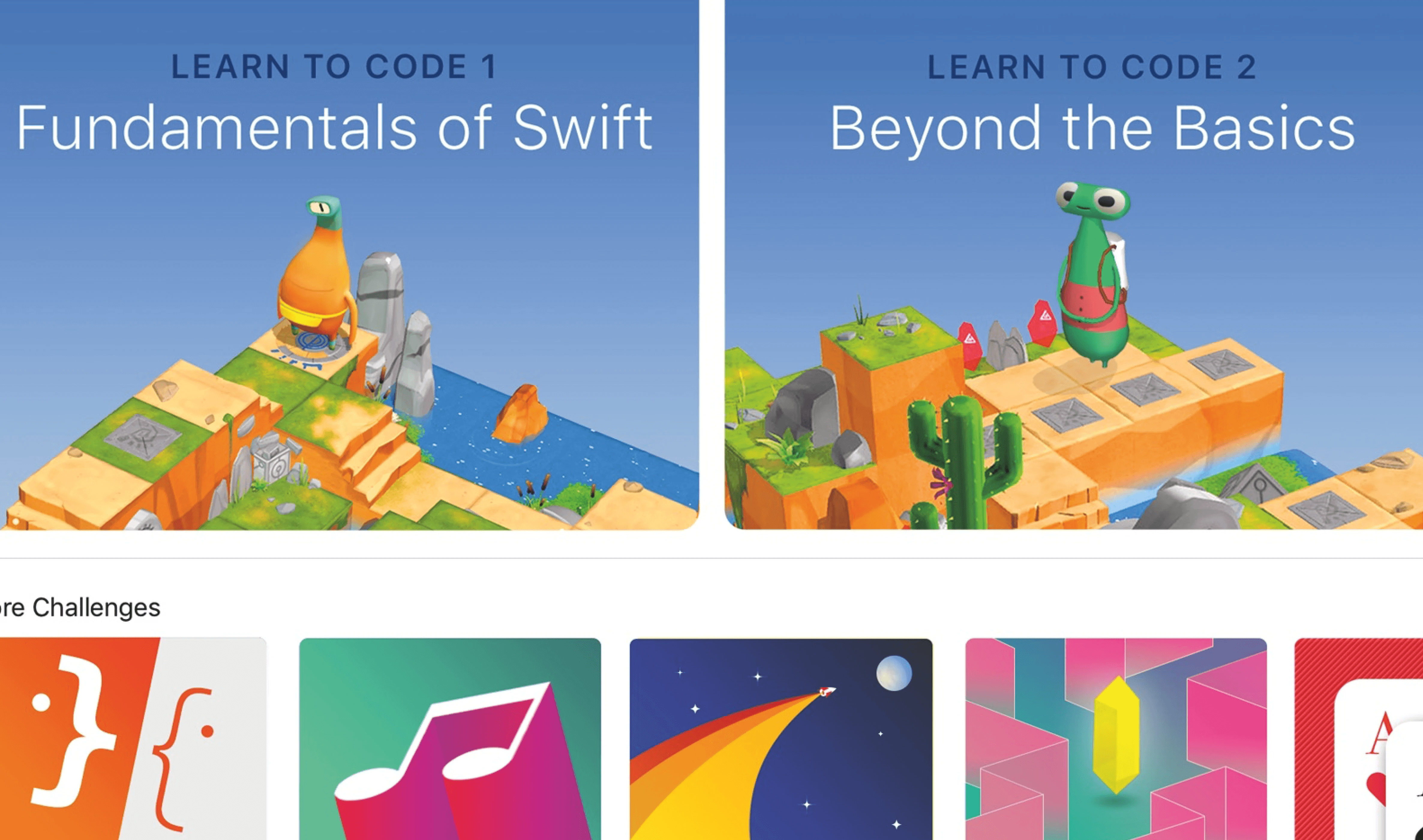
Setting aside the score issue and thinking more of the essence of the user's experience, we wanted it to be very inviting and fun. Taking in many resources for inspiration, Uno™ the card game, Krogers™ Boost delivery campaign, Mediationic Games™ "Fall Guys" x-box game, and the Apple™ Swift Playgrounds app. All of with possessed bright assuring colors, solid respect for negative spacing and an ease of attitude.
Design Process - Influence
Setting aside the score issue and thinking more of the essence of the user's experience, we wanted it to be very inviting and fun. Taking in many resources for inspiration, Uno™ the card game, Krogers™ Boost delivery campaign, Mediationic Games™ "Fall Guys" x-box game, and the Apple™ Swift Playgrounds app. All of with possessed bright assuring colors, solid respect for negative spacing and an ease of attitude.


Design Process - Branding the Experience
We branded the experience subtly. Avoiding user exhaustion with over-representation of the State Farm brand, we borrowed the DNA of the logo and hybridized the primary nav icons and other design elements. The infusion resulted in an omnipresence of the brand without over saturation. In this micro-effort, we designed passed the "less is more" practice and were striving for user subconscious registration.

Challenges & Constraints
The largest contribution to the, Challenge(s) & Constraint(s), would be we were a minimal headcount for the team, four in total. One design lead (me), one researcher and two other innovation thought leaders offering reviews, guidance and light art direction for brand alignment. The spirit of the effort was very hush-hush, so keeping such an endeavor quiet had its own particular hurtles.
Reflections
The final prototype was well received and then promptly shelved for the future. Chances are if we move forward with such an application it will be a completely different animal due to the ever evolving market, industry, interaction design and technology. This was an amazing experience.
Reflections
The final prototype was well received and then promptly shelved for the future. Chances are if we move forward with such an application it will be a completely different animal due to the ever evolving market, industry, interaction design and technology. This was an amazing experience.
Reflections
The final prototype was well received and then promptly shelved for the future. Chances are if we move forward with such an application it will be a completely different animal due to the ever evolving market, industry, interaction design and technology. This was an amazing experience.
