
The New Customer
She is a brand-loyal, casual shopper that browses for quality products at discount.
"I like to shop for my family. Helping them design the walls of the homes."
The New Customer
She is a brand-loyal, casual shopper that browses for quality products at discount.
"I like to shop for my family.
Helping them design the walls of the homes."
The New Customer
She is a brand-loyal, casual shopper that browses for quality products at discount.
"I like to shop for my family. Helping them design the walls of the homes."
The New Customer
She is a brand-loyal, casual shopper that browses for quality products at discount.
"I like to shop for my family. Helping them design the walls of the homes."
The Legacy Customer
He is professional craftsman in the framing industry.
"Larson-Juhl is my go-to. Selection and dependability is what's most important. Time is money."
The Legacy Customer
He is professional craftsman in the framing industry.
"Larson-Juhl is my go-to. Selection and dependability is what's most important. Time is money."
The Legacy Customer
He is professional craftsman in the framing industry.
"Larson-Juhl is my go-to. Selection and dependability is what's most important. Time is money."

Two-state e-commerce solution
Two-state e-commerce solution
Larson-Juhl™, a Berkshire Hathaway company, stands as the premier global provider of custom picture framing products. With origins dating back to the late 1800s, the company boasts a legacy rooted in craftsmanship and excellence.
Larson-Juhl™, a Berkshire Hathaway company, stands as the premier global provider of custom picture framing products. With origins dating back to the late 1800s, the company boasts a legacy rooted in craftsmanship and excellence.
Larson-Juhl™, a Berkshire Hathaway company, stands as the premier global provider of custom picture framing products. With origins dating back to the late 1800s, the company boasts a legacy rooted in craftsmanship and excellence.

Objective
Objective
Objective
Larson-Juhl were very concerned with not loosing the loyalty of their craftsmen and artisans, cultivated over the decades. The Larson-Juhl's brand is synonymous within the framing industry. They did not want to simply broaden the access of their product line to the general shopper/consumer, they wanted to truly modernized their online branded experience. The objective was to offer a highly intuitive shop-flow, create a synergistic platform amongst their general shoppers & craftsmen and finally, cultivate a practice of continuous evolution.
Modernizing their branded online experience began with being undedicated to any particular color scheme - allowing for more flexibility with visual impressions. Deep respect was paid to negative spacing with text and elements, lowing scan exhaustion. Imagery was scrutinized, ensuring the highest level of inspiration. We understood that shoppers buy the potential of what their lives could be with any of the Larson-Juhl products, so we made sure to present impressive environments the products sat in. The brand itself was relegated to the most important space (upper-left), ever-present and never intrusive.
Offering an intuitive shop-flow, reduced fall-off and/or abandonment as much as possible. It was a core design/development. The previous website was e-commerced enabled but was a bit disjointed, clumsy and confusing. It was noted through User interviews that the navigating and ordering process took time to learn. It was antiquated. The click/tap reduction was paramount in getting the buyer to the checkout/confirmation steps. A mantra of “Easy to use. Easy to understand.” was generated as an evaluation point in deciding what navigation solution to incorporate.
Larson-Juhl recognized the synergetic opportunities with syncing up their general shopper with their artisans. The notion was to offer a platform to where a general shopper could commission an artisan for custom jobs. Obviously this would require account statuses of each.
Lastly, they wanted to cultivate a mindset and practice of continuous growth. Exercise expiration to address the “what-ifs”. Build channels where all users opinions were vetted and brought into the fold of consideration - concerns, advice and any opinions.
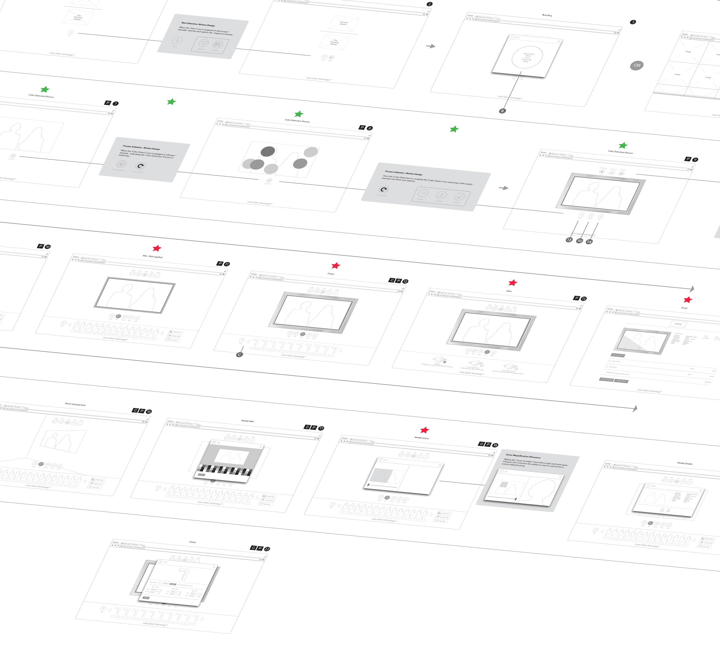
Blocking & Wire Framing
Blocking & Wire Framing
Blocking & Wire Framing
Working with various product owners, adhering to the design thinking process, we swiftly moved through empathizing and identifying and moved unto ideating quickly. Whiteboard concepts turned to preliminary blocking. Even at this stage, the notion of relating to the user the possibilities of what could be with the purchase of any Larson-Juhl products was starting to show. Smart taxonomy helped cement the need for inspiration early on .
Working with various product owners, adhering to the design thinking process, we swiftly moved through empathizing and identifying and moved unto ideating quickly. Whiteboard concepts turned to preliminary blocking. Even at this stage, the notion of relating to the user the possibilities of what could be with the purchase of any Larson-Juhl products was starting to show. Smart taxonomy helped cement the need for inspiration early on .
Working with various product owners, adhering to the design thinking process, we swiftly moved through empathizing and identifying and moved unto ideating quickly. Whiteboard concepts turned to preliminary blocking. Even at this stage, the notion of relating to the user the possibilities of what could be with the purchase of any Larson-Juhl products was starting to show. Smart taxonomy helped cement the need for inspiration early on .


Further development flushed out refinements by reducing the click-count of the navigational behavior. This shrinking of the click-count directly corresponded to a reduction in any potential cognitive loading … over-loading. We created a more user-centric page experience. Crafting impressive visual entertainment (product(s), environments and storytelling) alongside informative content, allowed the user to feel less motivated to click aimlessly. We wanted the user to navigate conservatively with a deliberate understanding of why they we're moving on from one screen to the next. More of a purpose driven click and less explorative.
The meat & potatoes of the site was the "Our Products" section, housing a very intentional layout of components with specific jobs. From the top down… Style Box Carousel - to inspire, impress and motivate purchasing. Body Content - a simple but very affective staple of information. Dynamic Search Bar - this is the power plant of the entire operation. We iterated dozens of prototype before concluding. With this component, the user could search, filter, sort, learn and zero-in on and add-to-cart the best product(s) solution without every leaving their current location. The Search results area was grafted on to the Dynamic Search Bar to complete the feedback loop between the user and the system. But the view-formats were feature rich. The last section was meant to support any type of promotional content that might not be product related - such as an event or needed awareness. Lastly, the footer. Branded appropriately with easy to read formatting of all the navigational options not found in the header nav.
Below is a small sample of the wireframes and layout structure.


Designs
Designs
Designs
The Home screen aesthetics establish the overall experience to be expected - calm, spacious and informative. Meeting the user instantly is the brand, a simple inspirational invitation, a stunning imagery carousel and the appropriate nav-options (Search/Menu/Login). The color scheme peppered throughout was vetted for accessibility and purposely dial to a muted tone to coincide with the product lineup. The only caveat is the "Dynamic Search" bar is substituted with the "Celebrating Custom Framers" component. It being present here showed the high-level of respect for the artisan community.
Special Note: any and all text was machine generated for the sake of layout and spacing..

Navigating passed the home screen to a the product(s) screen, consistency is maintained. Slight changes are made, but fit seamlessly. The major difference is the the now present Dynamic Search bar. This component is a serious carryover from the artisan legacy experience. They (artisans) wanted to be able to keep their product ordering ability. We not only kept it, but greatly enhanced it - visually and functionally. It truly is the heartbeat of the operation. At this state, the user is viewing the search results in "Swatch" mode.
Navigating passed the home screen to a the product(s) screen, consistency is maintained. Slight changes are made, but fit seamlessly. The major difference is the the now present Dynamic Search bar. This component is a serious carryover from the artisan legacy experience. They (artisans) wanted to be able to keep their product ordering ability. We not only kept it, but greatly enhanced it - visually and functionally. It truly is the heartbeat of the operation. At this state, the user is viewing the search results in "Swatch" mode.
Navigating passed the home screen to a the product(s) screen, consistency is maintained. Slight changes are made, but fit seamlessly. The major difference is the the now present Dynamic Search bar. This component is a serious carryover from the artisan legacy experience. They (artisans) wanted to be able to keep their product ordering ability. We not only kept it, but greatly enhanced it - visually and functionally. It truly is the heartbeat of the operation. At this state, the user is viewing the search results in "Swatch" mode.
Navigating passed the home screen to a the product(s) screen, consistency is maintained. Slight changes are made, but fit seamlessly. The major difference is the the now present Dynamic Search bar. This component is a serious carryover from the artisan legacy experience. They (artisans) wanted to be able to keep their product ordering ability. We not only kept it, but greatly enhanced it - visually and functionally. It truly is the heartbeat of the operation. At this state, the user is viewing the search results in "Swatch" mode.

Here is an example were the user selected the "Corners" mode to review the search results.
Here is an example were the user selected the "Corners" mode to review the search results.
Here is an example were the user selected the "Corners" mode to review the search results.


Here is an example were the user selected the "Details" mode to review the search results.
Here is an example were the user selected the "Details" mode to review the search results.
Here is an example were the user selected the "Details" mode to review the search results.
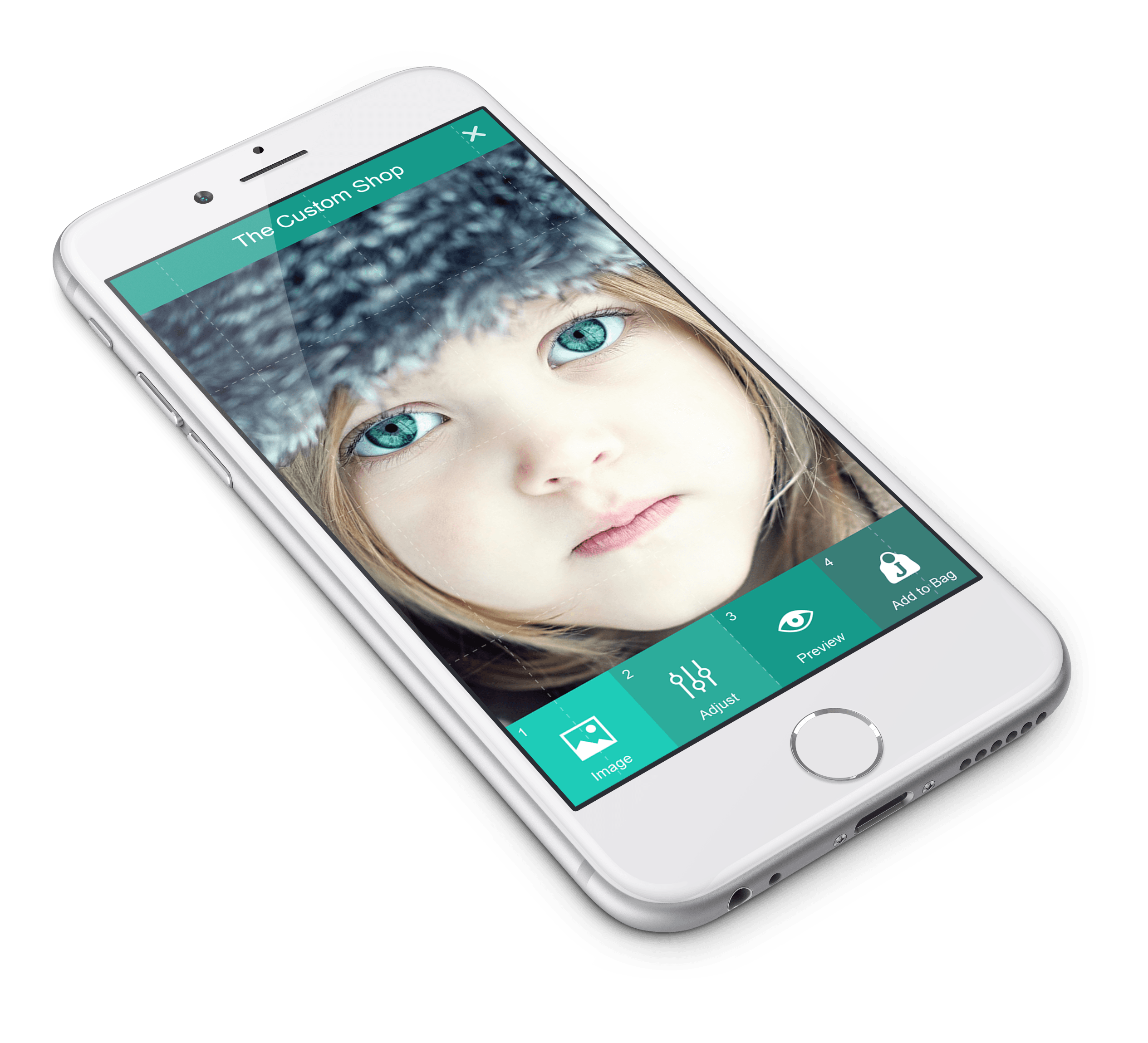
Mobile
Mobile
Mobile
The design transitioned easily to the smallest of viewports. The UX was never challanged by any breakpoints. The tap verses click also was a super smooth transition.
The design transitioned easily to the smallest of viewports. The UX was never challanged by any breakpoints. The tap verses click also was a super smooth transition.
The design transitioned easily to the smallest of viewports. The UX was never challanged by any breakpoints. The tap verses click also was a super smooth transition.


After the successful launch of the LJ.com site, I was invited to stay on to lead the design of a few more products. These efforts primarily were joint-branded efforts between Larson-Juhl and other well known brands such as FujiFilm, Home Depot, Joann and others. Below are small snippets.
After the successful launch of the LJ.com site, I was invited to stay on to lead the design of a few more products. These efforts primarily were joint-branded efforts between Larson-Juhl and other well known brands such as FujiFilm, Home Depot, Joann and others. Below are small snippets.
After the successful launch of the LJ.com site, I was invited to stay on to lead the design of a few more products. These efforts primarily were joint-branded efforts between Larson-Juhl and other well known brands such as FujiFilm, Home Depot, Joann and others. Below are small snippets.