


LexisNexis white-label.
BMW custom fit.
LexisNexis white-label.
BMW custom fit.
LexisNexis white-label.
BMW custom fit.
LexisNexis white-label.
BMW custom fit.
Initially a LexisNexis™ white-label application, significant and tailored design allowances were implemented specifically for BMW to enhance their digital presence.
Initially a LexisNexis™ white-label application, significant and tailored design allowances were implemented specifically for BMW to enhance their digital presence.
Initially a LexisNexis™ white-label application, significant and tailored design allowances were implemented specifically for BMW to enhance their digital presence.
Initially a LexisNexis™ white-label application, significant and tailored design allowances were implemented specifically for BMW to enhance their digital presence.

Overview
The name for the applications underwent several iterations before settling on "ConnectedCar®" for the handheld app and "Road Assist+®" for the in-car app. This product is a white-label solution designed to create a symbiotic relationship between the handheld device and a vehicle's touch screen. It ensures a seamless transition between the handheld (Android/iPhone) and vehicle, allowing them to move effortlessly between the two.
The application suite monitors driving behavior with the goal of encouraging improvement. Additionally, it serves as a safety tool, offering roadside assistance and emergency support when needed.
With BMW, custom design modifications were meticulously worked up for BMW to strengthen their digital footprint, matching their other online spaces having fresh and futuristic impressions.

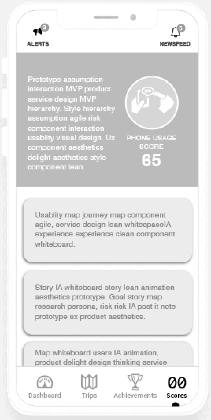
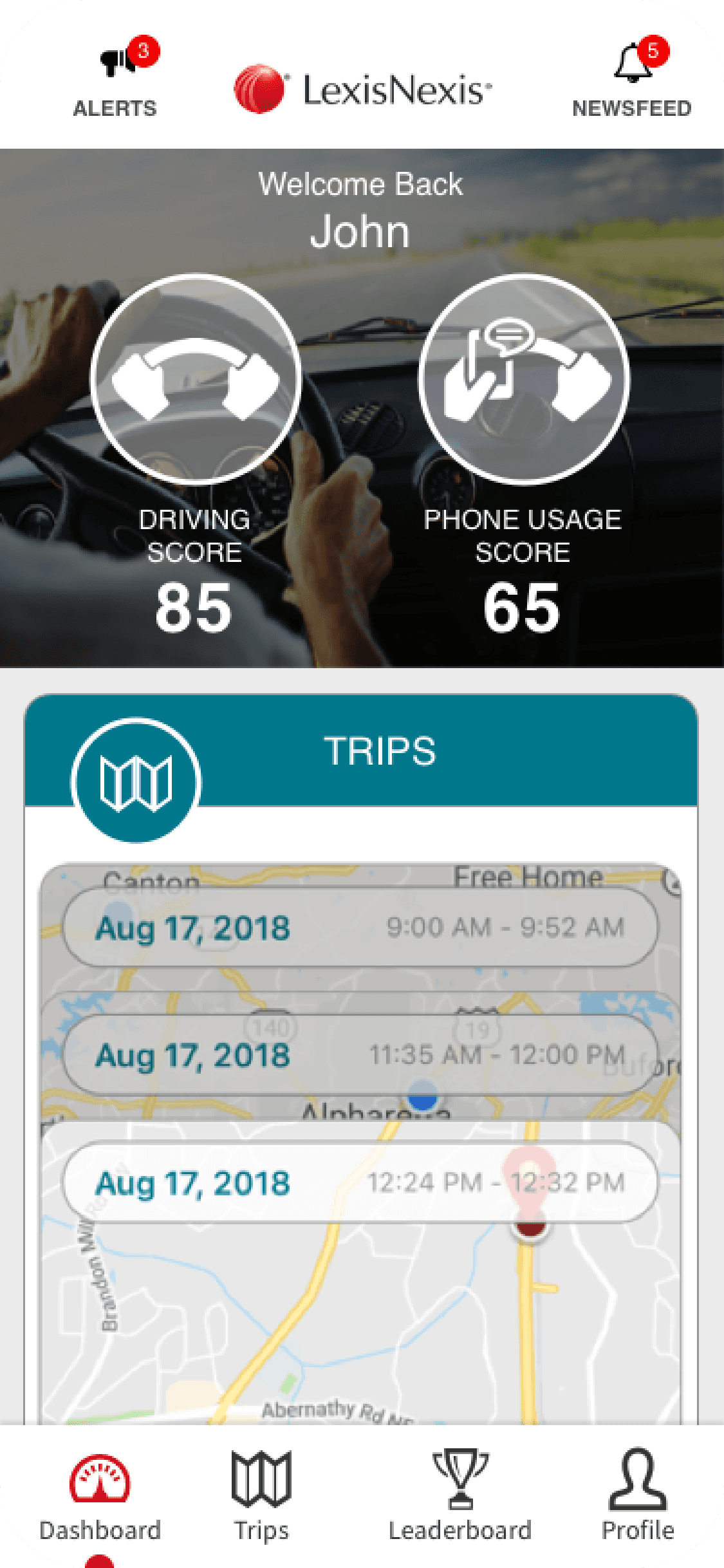
Dashboard Layout
Branding, scores and the primary nav options were the elements needing representation more so than anything else. Branding was obvious, the scores displayed the user's driving and phone usage and the options were a collection of access points to badges, trips, scores (deeper dive) and wins. The gamification was maintained.
UI Design - Landing screens and navigation
After launching the app, the user would see a well structured layout designed to guide the eye in such a way as to reduce cognitive load instantly. With a quick scan, the user would see an appropriately timed greeting (good morning or good evening) along with their name personalizing the experience. Next, the branding with a strong association to the navigation, which is ever-present. Finally the other primary CTAs - badges, trips, scores and wins. Regardless of the path taken to visit the subsections, the personality of the design is consistent, entertaining and informative.


Exploration Wireframes
With the general white-label application, the product design was purposely geared to have the most B2B widespread adoption. Being able to graft the product into a customer's brand eco-system was paramount. Simple, safe and easy to understand by the general population was the objective. The gamification aspect included the standard points, leaderboards, achievements and scores. The Brand was centered in the header and aligned with two icon ports designed to be interchangeable allowing for a more custom control. The body is primarily filled with metric cards relating to the sub-section. For the sticky footer navigation we incorporated a well-known pattern that would very recognizable and intuitive. The flows were flat with easy to understand cards.


Exploration Design
With one design explorations/iterations, we introduce a frosty white treatment to the greeting, scores and CTAs. This allowed a larger range of types of background imagery to be used.
Exploration Design
With one design explorations/iterations, we introduce a frosty white treatment to the greeting, scores and CTAs. This allowed a larger range of types of background imagery to be used.


Exploration of the Build Process
With the build process, a client would select from one a few themes, dial in custom CSS with certain screen elements (typography, buttons and such) along with a dark and light mode capability built-in
Exploration of the Build Process
With the build process, a client would select from one a few themes, dial in custom CSS with certain screen elements (typography, buttons and such) along with a dark and light mode capability built-in


Exploration Design - score feature
The iterations were countless. Here are few that survived the crucible the longest. We play around with the use of color as well as all-white treatments with varying layouts and data point presentations.
Exploration Design - score feature
The iterations were countless. Here are few that survived the crucible the longest. We play around with the use of color as well as all-white treatments with varying layouts and data point presentations.


"Roadside Assist+"
This product, Roadside Assist+®, is an adaptation of our mobile app, which serves as a roadside assistance tool meant to complement the mobile device app. Distilling the metics down to two - one the user's driving score and the other, a call to action for help. The user's driving score in very similar in the mobile app, with a score accompanied with a breakdown of local speeding, high speeding, hard braking and nighttime driving. Each had a value score with star-counts. The "Tap for Help" option was offered as an continuous accessible feature. In a situation where the driver broke down and needed assistance, the feature would help evaluate the situation and assist in initiating any third party requirements - towing, insurance and or emergency requests.


Wireframe
The direction was to respect the very low tap allowance enforced by Google, we had to insure critical options were reachable inside of eight taps. Choice reduction was paramount in the wire framing phase.
Wireframe
The direction was to respect the very low tap allowance enforced by Google, we had to insure critical options were reachable inside of eight taps. Choice reduction was paramount in the wire framing phase.
Wireframe
The direction was to respect the very low tap allowance enforced by Google, we had to insure critical options were reachable inside of eight taps. Choice reduction was paramount in the wire framing phase.
UI - Launch Screen Icon (Mitsubishi)
The UX would start with tapping the Road Assist+® launch icon to initiate the app. The design requirement for the icon was stringent - basic shapes and color usage.
UI - Launch Screen Icon (Mitsubishi)
The UX would start with tapping the Road Assist+® launch icon to initiate the app. The design requirement for the icon was stringent - basic shapes and color usage.

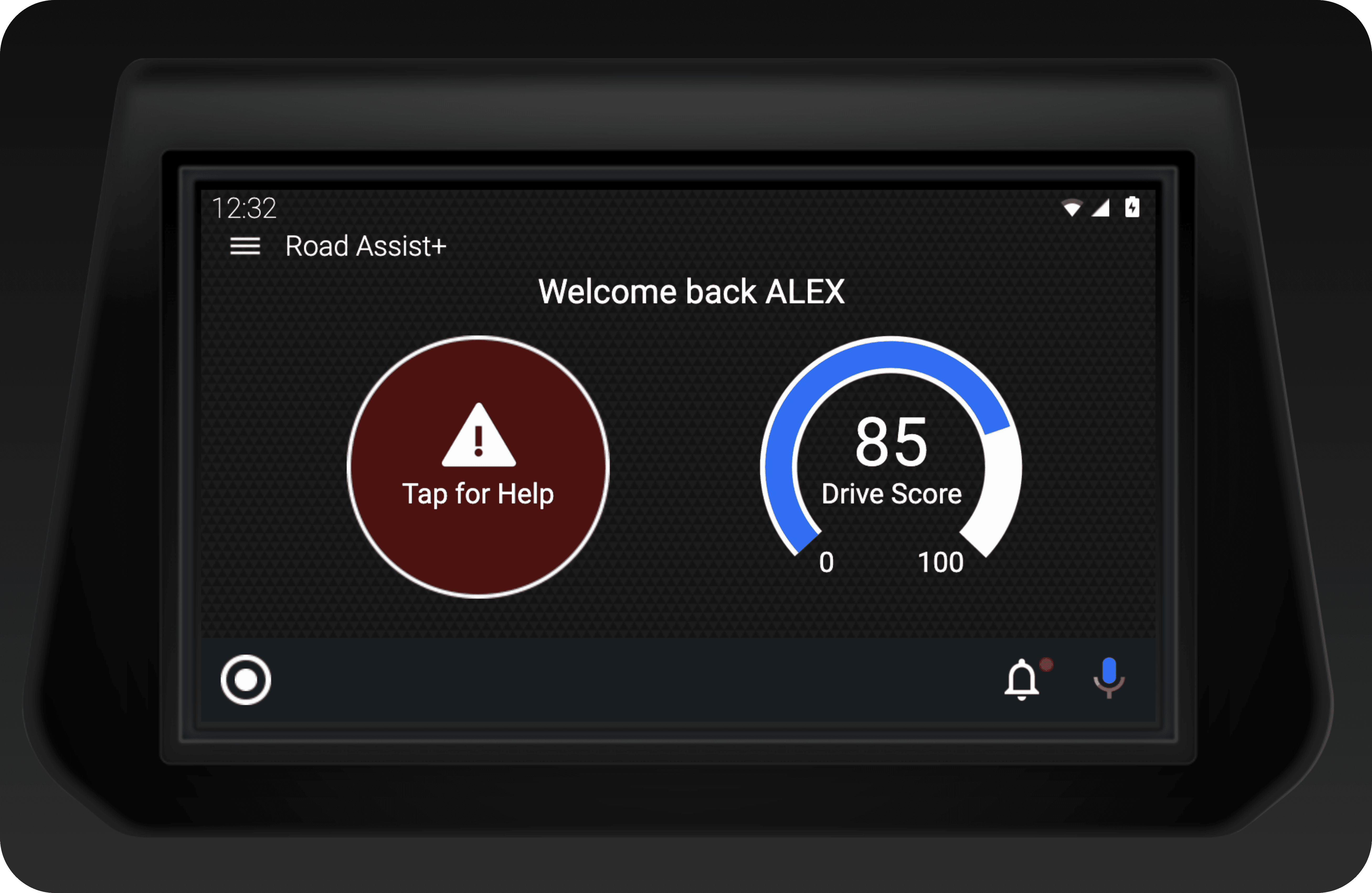
UI - Dashboard
The native operating system was worked in the UI. Once again, keeping in mind the tap-allowance of eight, we designed the elements to be as clear and intuitive as possible. Reducing the need for exploration-to-understanding.
UI - Dashboard
The native operating system was worked in the UI. Once again, keeping in mind the tap-allowance of eight, we designed the elements to be as clear and intuitive as possible. Reducing the need for exploration-to-understanding.

UI - Drive Score screen
We designed a screen to display the four major driving behaviors being monitored - local speeding, highway speeding, hard braking and nighttime driving. Each of these categories used a five-star measurement to indicate the level of proficiency.
UI - Drive Score screen
We designed a screen to display the four major driving behaviors being monitored - local speeding, highway speeding, hard braking and nighttime driving. Each of these categories used a five-star measurement to indicate the level of proficiency.

UI - "Tap for Help" sub-screen
These were the top seven emergency situations surveyed - lack of fuel, flat tire, stuck, dead battery, car crash, need a tow and unknown. When the user selects one of these options, the metric relayed to the third parties, such as a towing dispatch and insurance.
UI - "Tap for Help" sub-screen
These were the top seven emergency situations surveyed - lack of fuel, flat tire, stuck, dead battery, car crash, need a tow and unknown. When the user selects one of these options, the metric relayed to the third parties, such as a towing dispatch and insurance.